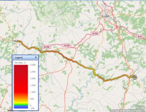
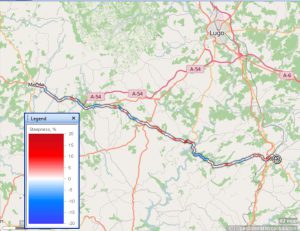
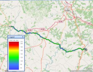
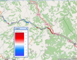
Wow, finishing cycling early has given a lot of time on the computer. Earlier, I linked a bad night to fears that some of my academic/research work on “outcome measurement” actually, it’s change measurement and the first bit of overegging in our field is that we all give in to social and political pressure and talk about “Outcomes” with a big “O” as if that’s what they are. Well, sometimes they really are: death is an outcome, it’s an outcome that awaits all of us, but if you’re in the mortality game (and we all are, not just the oncologists, surgeons, politicians and actuariess) the timing of that outcome does matter and oncology wouldn’t have made much of the progress it has without recording times of death, without good statistical methods for analysing it. It’s not as simple as it sounds because we can die for many reasons, though all of those are deaths, and because it may matter how old we are when we become at risk, and because not all people known to be at risk and treated one way or another are yet dead, for one reason or another, at the point you analyse your data, and because some are “lost to follow up”.
Millions and millions of pounds has, mostly rightly I think, been spent collecting datasets about survival after diagnoses of cancer (and pre-cancerous states, and known risks of cancer) and a fair bit of money and real mathematical/statistical genius, and huge amounts of computer storage and time, have all been thrown at this. I say “mostly rightly” as the only danger of all of this is that can, and in the past did, problematically, sidestep the question of the quality of life with the risk that treatments that lengthened survival a little, but devastated quality of life, were perhaps seen too positively. How to factor Quality of Life (QoL) in alongside mortality remains a huge issue. In some, small but at times useful ways, I think my work and the work of the huge numbers of people who have helped us on the CORE project (www.coresystemtrust.org.uk) touches on the QoL issue, particularly the work of Iphigenia Mavranezouli on the CORE-6D scoring.
However, what worries me is that the political pressures, and the human and societal pressures for much greater certainty, much avoidance of Fear, much intolerance of Doubt (you knew FUD wasn’t going away didn’t you?!), these all mean that data is now collected, and analysed, incoherently.
Ah, damn, I don’t really have the ‘photo I want, of the crossing in the cathedral in León, I guess it was one where my effort was really too bad to keep. However, this is León cathedral, with scaffolding.

You pay up your entry fee and get a huge colour A4 booklet about the cathedral, but if you’re cycling onwards, you ditch that (in Rabanal when I had time to scan read it enough) as, beautiful though it is, and in Spanish and English, it’s too heavy to come all the way home. However, I loved a quote from Mariano Diez Sáenz de Miera “co-author of the Cathedral’s Master Plan” (capitals in the original):
“The day that the Cathedral’s scaffolding disappear it will be a bad sign because León’s Cathedral is like a sick person who is stable but needs constant care”. I thought that was genius. In the (?) 18th Century the lovely Gothic crossing was replaced with a Baroque octagon, by the 19th Century that, and other changes, and the fact that the stone is beautiful but prone to flaws, and the fact that it was all put on top of a Roman baths (with lots of hypocaust hollows still there by the sound of it) and a Romanesque church on top of that, all meant the cathedral was starting to collapse, pretty literally with stones falling. The whole had to be shored up and the Baroque crossing taken out and the simpler, structurally far more sound, crossing put back in.
I think something similar is going to have to happen to health care. At the moment we have fantastic sums being spent on some things like new anti-cancer drugs, but we’re pricing ordinary people out of a “free to all at the point of delivery” health care system and many people are to my mind clearly very happy to do that, they’re sort of putting in Baroque altars that obscure simpler truths and simpler things that make people happy and healthy and always claiming the data shows that things are as good as the can be and better than the previous government etc. etc.
It’s all pretty mad to my mind: a cult of sales and advertising rather than critical thinking and sharing the sadness of things. Don’t get me wrong: I still think the NHS, I still think much in the idea of health care and even hospital based systems for that, have much in them that is brilliant. Visiting my now deceased father-in-law in hospital some years back when the NHS was, as it did repeatedly, unequivocally extending his life and his quality of life, I said to my mother-in-law that I thought hospitals were grim, sad places, full of death and suffering, touched with a sort of odd quiet like temples that are really about those things (death and suffering). (Yes, I’m a real joy to have with you on hospital visits. Actually, I think she would say that on balance I’m useful and supportive but I look back and can’t see that as one of my better moments.) Anyway, she was astonished and said, briliantly, “I see them as exactly the opposite: temples of hope”. I think we’re both right.
What’s this got to do with data and uncertainty and using data coherently? You don’t help overstretched services though with the kind of spin and “friends and family” tests and the constant farming out of some positive statistic or other to reassure everyone that the junior doctors are wrong, that the NHS is getting better when it’s one of the least well funded services in the Western world and when you’re actually attacking the glue systems that held it together to replace them with “market values”.
I can’t prove anything of this at the moment, in fact I think such systems are so complex we shouldn’t be thinking of “proving” much within them but of how to nurse them thoughtfully. That needs data, open data, openess to think about it.
Here’s another graphic:

Hm. I probably needed that a bit bigger but it’ll have to do for now. What the heck is that? “We want more beauty, more travel, not nasty data!” some might be saying and I sympathise and I would like to be putting up more ‘photos of León including its glorious, stably ailing, cathedral; of Astorga and a superb church I nearly missed here in Villafranca del Bierzo but bear with me.
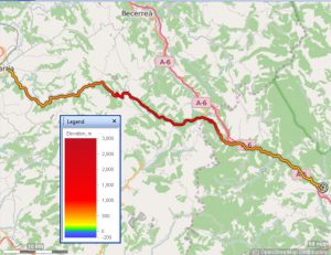
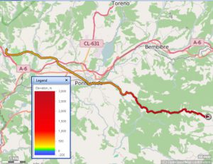
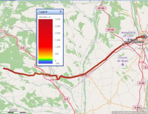
That’s a graph of my altitude on the bike today with metres above sea level on the y axis (i.e., and highly appropriately, vertically) and time on the x axis. You see that hard slog up from Rabanal to Crux de Ferro and the later true summit and then that 15km descent. The grey line is warming up my then frozen hands in Ponferrada and the second grey line is visiting the tourist information office here in Villafranca (lovely helpful lady) and the tiny last bit of black is from her to the hotel.
OK so far. But there’s something wrong isn’t there? The two grey bits should surely be pretty much level. OK, I didn’t restart the Garmin with the bike exactly where it was when I stopped it and I think both the drop in Ponferrada and the rise here are too big for the short distances moved between stopping and restarting the Garmin. So we learn that something is imperfect in the data. That’s fine, you can argue that no measurements are perfect, we just have to be thoughtful about the imperfection, perhaps we need to explore it.
That’s trivial by comparison with NHS data and healthcare and psychology data generally, but oh, so much of it is not being criticised contstructively, not being made stronger and more helpful, it’s just being used to paper over problems.
Now that takes me to a lot of other things but this is more than enough for now.
By the way, the plot was generated with the completely free R software system using packages that people wrote to handle GPS data. Just trivial use of it so far, much more fun to be had from that in the future, including drilling into the elevation data and how it’s generated. (I now suspect it’s atmospheric pressure, not GPS, but that does sound weird.) But why oh why do Garmin avoid open data standards and open source computer systems as far as they can? Why do they make it impossible to upload your data unless you’re running Windoze or a Mac? (That’s a huge part of why I have a Windoze machine with me: without it, or a Mac, literally no data from the Garmin.)

